Introduction
If you're in the e-commerce business, you probably know that the 4th of July is in the top 8 holidays when it comes to consumer spending. But just saying 'Top 8' doesn't mean much without actual data showing how important it is for businesses.
The National Retail Foundation (NRF) ran a study recently and the numbers were HUGE. 87% of Americans planned to celebrate Independence Day this year, and they're planning to spend $90.42 each on food items. But there is something else that gets us really excited for this holiday.
Even with inflation and supply chain issues still going strong, 26% of those celebrating said they will be purchasing additional items. Oh, and the percentage of those who are not sure? A whopping 32%!
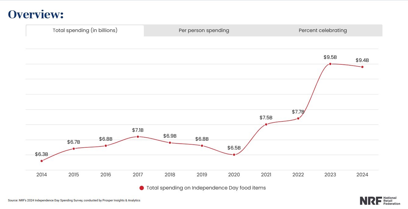
So with over 58% of potential customers, your email marketing game must be on point this holiday period. And we're here to help!
We've gathered a bunch of 4th of July email examples, some of it is our own work and some of it is from our fellow marketers around the globe. If you're feeling like you need that slight boost of creativity, or you just feel like checking out what others are doing, check out these 11 Fourth of July emails we handpicked.
Early Access Sale

Let's start with a simple one, shall we? We're not going to go into the good old "above or below the fold" debate, but we believe, when it comes to holiday sales, that the sooner you let the customer know what they're receiving out of the email, the better.
That is why this email is all about the "Red, White, and 20% Off". The balloons and colors add to the 4th of July vibe and the discounted prices really stand out against the white background. Simple, easy, and effective.
No Discount? No Problem.

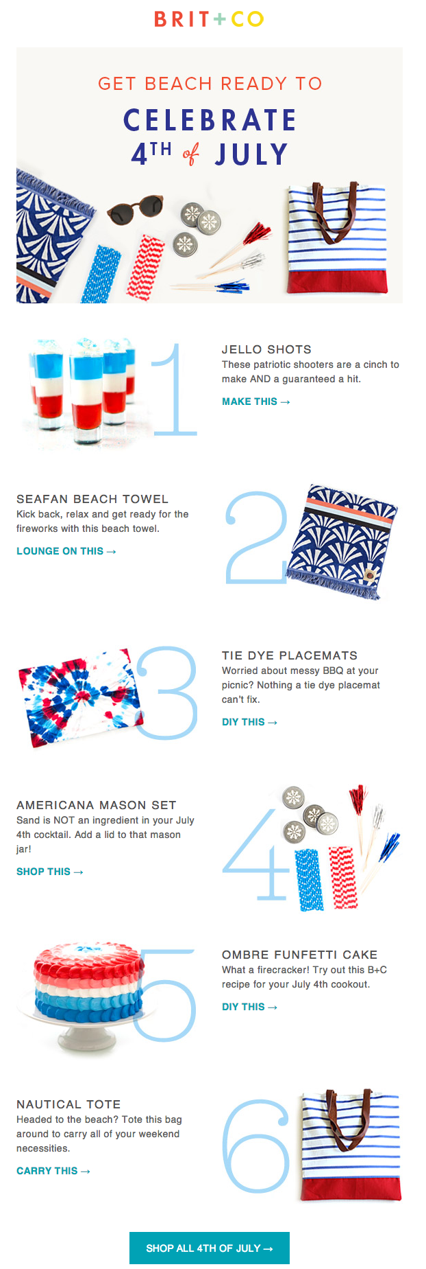
We know it's a tough year, and we also know that most of you feel the pressure to give a discount each holiday or mark down the prices. But you don't have to do that. Just take a look at Happy Socks or take a page out of Brit+Co's book.
First, you need to make sure your subscribers immediately know there's no sale going on. Setting the right expectations goes a long way. Second, emphasize all the benefits and fun customers can have with your products. Get them excited about buying that product because of everything they can do with it, not because it's on sale.
Fireworks and Mystery Bundles
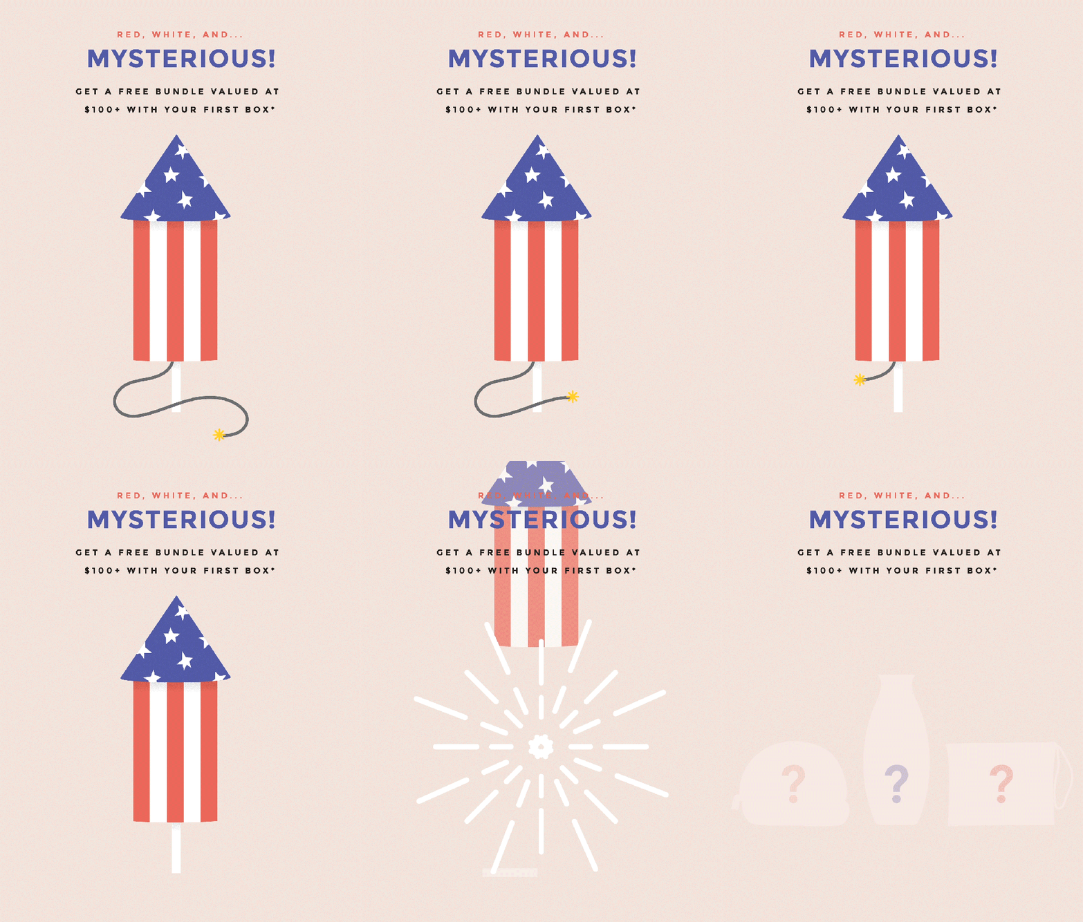
Independence Day—quite a busy day, wouldn't you say? Everyone has plans and places to go. BBQ to eat, fireworks to enjoy. So naturally, most customers won't spend a lot of time reading long, wordy email newsletters.
This simple, yet effective GIF from FabFitFun does the job all by itself. No long copy, no product recommendations or articles to read, just a nice firework animation teasing what the customer would get if they made a purchase.
The Checkerboard Effect
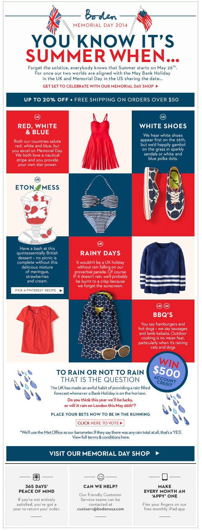
Wait, before you say anything, we know. It's not a 4th of July email, but the checkerboard design in combination with all the red, white, and blue from Boden USA truly wowed us that we just couldn't resist adding it to the list.
Even though the email is quite content-heavy, the seamless transitions + the font and color dynamics really make it engaging and easy to read through. Top that off with 20% off and free shipping, and you're golden.
Last Chance 4th of July Email

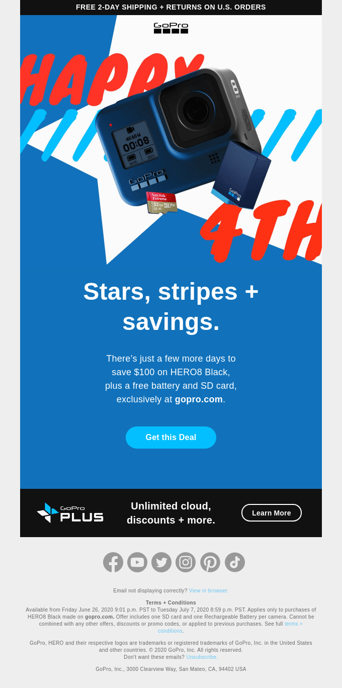
Did we mention no long copies? Oh well, here we go again...
Brit+Co and GoPro really understood the assignment and went with a short, on-point copy that grabs subscribers' attention. The fun categories at the bottom help drive more relevant clicks, while the light colors and fireworks just add a cherry on top.
GIFs! GIFs! GIFs!

Who doesn't love good animations? We know we do. BUT, one key aspect of a good GIF is that the animation and elements don't take too much attention away from the message. We think we accomplished that here, wouldn't you say?
And we know what you're going to say: "But you said no long copy". Hear us out. What works for one brand, probably doesn't work for a lot of brands. If you constantly stick to 'best practices' then everything you do will end up looking like what your competitors are doing. So experiment a bit, and see how it goes.
Stars, Stripes, and Special Offers?

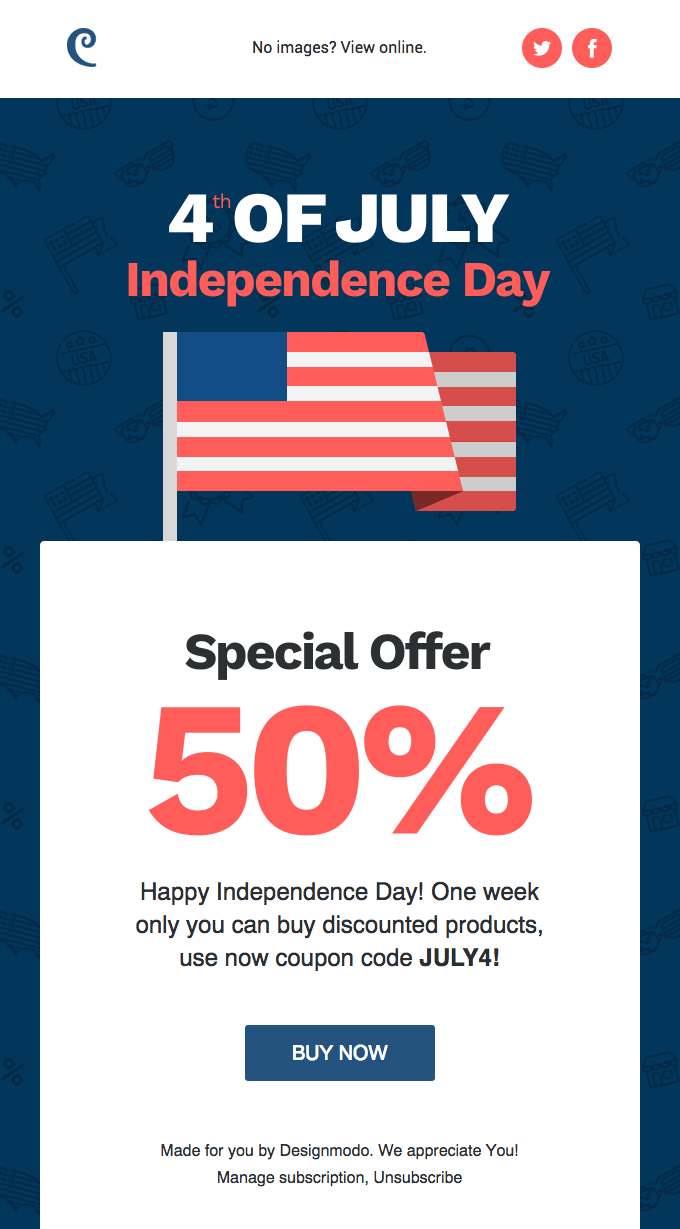
Okay, the stars are missing, but the flag is there, and that's what matters, right? Though, we doubt any DesignModo and Crocs subscriber said anything else apart from "50%???" and then proceeded to checkout.
There's a case to be made for content-heavy emails, and then there's a case to be made for short, one-pager emails. Both convert and both can be engaging. It all depends on your customers and product offers. If you're doing as big of a sale as this, then our take is—keep it simple. The offer will be good enough to make even the less engaged subscribers click through.
Boring B2B Emails? No, thank you.

Let's get one thing straight. B2B Emails don't have to be boring! Now say it louder for the people in the back. B2B Emails don't have to be boring! Okay, good.
For some reason, there's an idea out there that B2B emails have to be short, to the point with very little color. We don't agree, and probably, never will. While working on the email we gave our best shot at making it both fun and professional. The only problem? We couldn't seem to agree on whether it's a GIF with a G or a J...
Secret Recipe for a Successful Holiday Email
Well, it's not really a secret but given how many marketers tend to overcomplicate holiday emails, we felt like we needed to remind everyone of the "secret to success".
If you don't have a specific message you want to send or you feel like there's no need to convince the subscriber much on what you're selling, then stick to the basics for your holiday emails.
A flyer-like email will most likely do the trick just fine. Light colors coupled with elements like fireworks, BBQ, balloons, flags, stars, and stripes, will immediately let them know it's a 4th of July email. Add on top of that short, to-the-point copy, with the discount emphasized in bold letters, and you've hit the holiday email jackpot.

Roland Bicók
Performance Marketing Specialist @ The Better Creative · Updated June 17, 2025