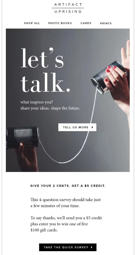
Typography in Email Design: A Silent Game-Changer
Typography, while often overlooked, is a silent yet powerful player in digital communication. In the universe of email design, where every element must capture attention within seconds, the art and science behind typography in email design bear an impact. This isn't just about selecting 'pretty' fonts—it's about weaving psychology, aesthetics, and functionality into a coherent tapestry of engagement. Let's explore the depths of typography's role in crafting compelling emails.
Typography Fundamentals in Email Design
Understanding Typeface Personalities in Email Design
At the very core, typefaces are visual representations of sound—of voice. And like voices, fonts have personalities, tones, and emotions.
- Serif Fonts like Times New Roman or Georgia exude tradition, respectability, and reliability. They're the old, wise figures of the typographic world and are often chosen by institutions like banks or universities.
- Sans-serif Fonts such as Arial or Helvetica radiate modernity, simplicity, and clarity. Tech companies, startups, or contemporary brands tend to lean towards these for their clean lines.
- Script Fonts like Pacifico or Brush Script mirror elegance, creativity, and personal touch. They might grace wedding invitations or boutique brand communications.
Choosing a typeface is akin to choosing a voice actor for your brand's message. It should encapsulate and project the brand's ethos and desired emotional impact.
Typography Structure: Importance of Size in Emails
Emails aren't just about what you say, but how you structure what you're saying. Naturally there are some email marketing types that you need to take into consideration as well. Even then the basic principals are the following:
Font size can guide readers, emphasizing critical points and creating a visual hierarchy.
Headings are larger, capturing attention and setting the tone. Subheadings break content, guiding readers through sections and offering a reprieve from uniformity.
Body Text remains consistent, ensuring readability. Too small, and you risk alienation; too large, and you may come across as shouting.

Font Choices and Their Impact in Emails
Web Safe Fonts: Ensuring Email Consistency Across Devices
Digital communication thrives on consistency. This is where web safe fonts shine. These are the typefaces that come pre-installed on a vast array of operating systems and devices, ensuring that your email retains its intended appearance no matter where it's viewed. They act as the backbone of email design.
Why are they so vital? Consider the diverse array of devices and email clients. From Outlook on a Windows machine to Apple Mail on an iPhone, there are countless platforms on which your email can be accessed. Web safe fonts ensure a consistent, undistorted experience.
Examples of these fonts include Arial, Times New Roman, Georgia, and Verdana. Each of these has been optimized for on-screen reading and is widely recognized for its ability to display correctly across platforms. While their range might seem limited compared to expansive online font libraries, their reliability in ensuring a consistent user experience is invaluable.
Exploring Custom Fonts: Benefits and Challenges in Emails
Designers craft unique fonts that can significantly boost branding, and emails can benefit from this trend as well. Many brands want to incorporate these unique, downloadable fonts in their emails for a distinct edge.
However, downloadable fonts come with challenges. The first hurdle is compatibility. Not all email clients support custom fonts. While Apple Mail might beautifully display your custom font, clients like Gmail or Outlook might default to a more generic font, altering your design's visual flow. Additionally, the font file's weight might increase the email's loading time.
If you're considering using downloadable fonts, follow these best practices:
- Fallback Fonts: Always have a web safe font as a backup in your email's CSS. This way, if the custom font doesn't display, the email will use a reliable alternative.
- Testing: Test the email on multiple clients and devices before launching a campaign. Ensure the font either renders correctly or gracefully switches to the backup.
- Licensing: Ensure you have the appropriate rights to use the font in emails. Licensing issues can be intricate, and not all web fonts may be licensed for your purpose.
The balance between a unique brand identity and universal accessibility is essential. While downloadable fonts offer branding advantages, they require careful use and ample precautions.

The Power of Typography in Email Communication
Typography in email design isn't just about legibility—it's about engagement, emotion, and brand reinforcement. As we craft emails, understanding the power embedded in our typographic choices ensures our messages aren't just read, but felt and remembered. The next time you open an email editor, remember: those fonts, sizes, and spacings are tools, and with the right craftsmanship, they can elevate your email game phenomenally.

Nikola Milošević — Growth Strategist @ The Better Creative. Updated October 19, 2023